Sep 01 2019
AMSI: Automotive Ads, Emails, Websites & Web App
I designed and led development of Phalanx, a custom system that streamlined AMSI’s digital production, increased task efficiency by 400%, reduced errors by 90%, and delivered a 50% ROI while ensuring compliance across ads, emails, and websites.
Outcomes
- Increased task efficiency by 400%
- Reduced accessibility, compliance, and coding issues by 90%
- Achieved 50% return on investment (ROI)
- Standardized the production of websites, email campaigns, and ads, ensuring consistency and quality
- Helped prevent OEM compliance penalties for automotive clients across brands like Aston Martin and Volvo
Problem
AMSI, an agency handling digital advertising for automotive clients, was operating without a centralized project management or production system. The workflow was fragmented and manual, leading to frequent issues in responsiveness, accessibility, coding, and OEM compliance. These problems not only slowed production but also put clients at risk of non-compliance penalties.
Without a system to streamline asset creation or monitor performance, internal teams were siloed and overwhelmed. Projects often required duplicative work, QA suffered, and there was no scalable way to ensure consistency across responsive, accessible websites, emails, and ads. AMSI needed a full-stack solution to fix these bottlenecks and unify its design and development workflows.
Solution I Applied & Why
Recognizing the Problem Firsthand
When I started working at AMSI, I was designing and developing display ads, emails, and websites. It quickly became clear that recurring inefficiencies, poor collaboration, and inconsistent quality were major issues. These problems were visible in everything from code quality to missed accessibility and compliance standards.
Designing the Prototype & Securing Ownership
After identifying the operational gaps, I designed and developed a prototype for what would become Phalanx, a centralized production and project management system. I presented the concept, gained approval, and took full ownership of its development and evolution. I also led a team of designers and developers to support ongoing maintenance and feature expansion.

Building the Platform from the Ground Up
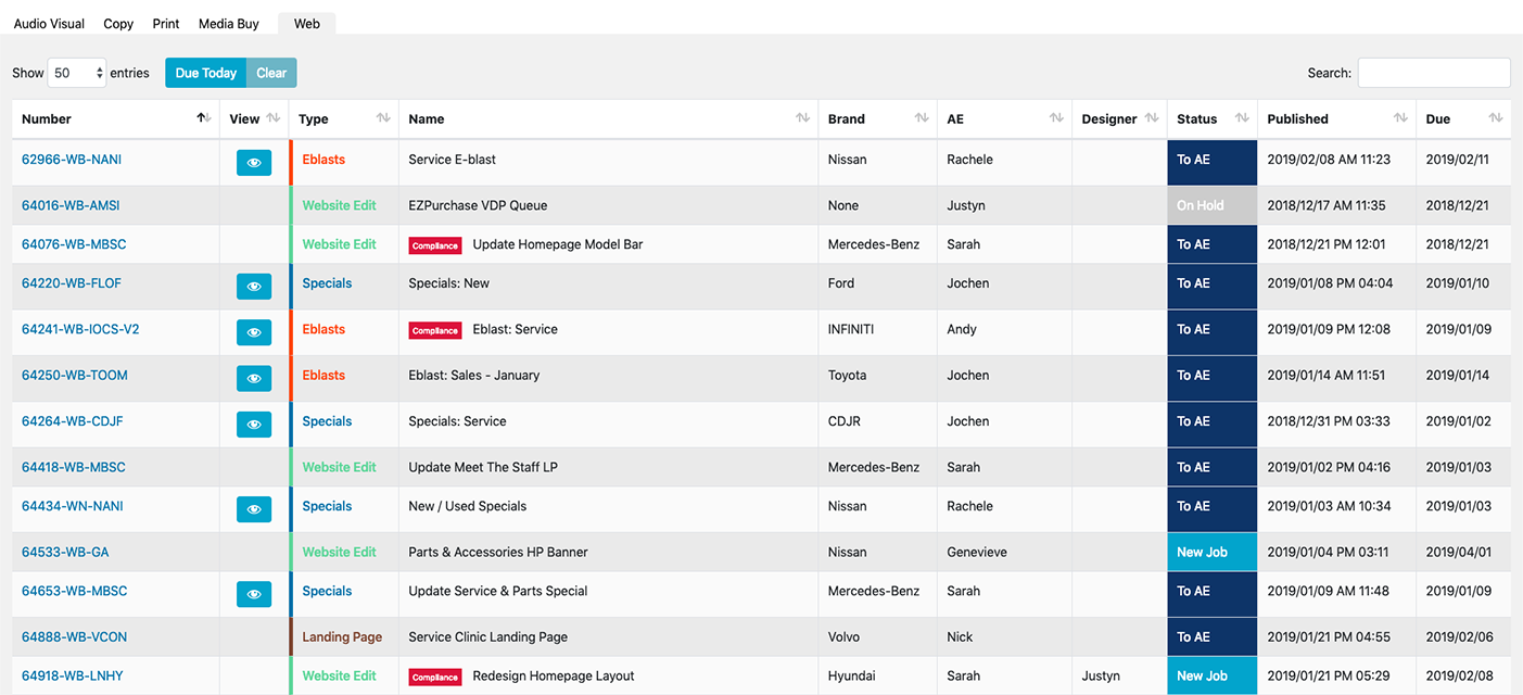
I built Phalanx using HTML, CSS, Sass, JavaScript, and PHP, integrating it with a custom WordPress environment. The platform featured tailor-made drag-and-drop modules, a reusable UI component library, and built-in compliance checks. Every element I designed and developed was fully responsive and met accessibility standards. I also built in systems for budget tracking, project management, staff assignments, and performance monitoring to address broader operational needs.
Designing for Every User
To ensure the platform aligned with real-world workflows, I created detailed personas for every user type, including media buyers, ad specialists, email marketers, project managers, designers, developers, and A/V staff. I ran targeted user tests to validate features and interaction flows. I used Adobe XD to design and test wireframes and high-fidelity prototypes before development, which saved significant time and eliminated costly rework.
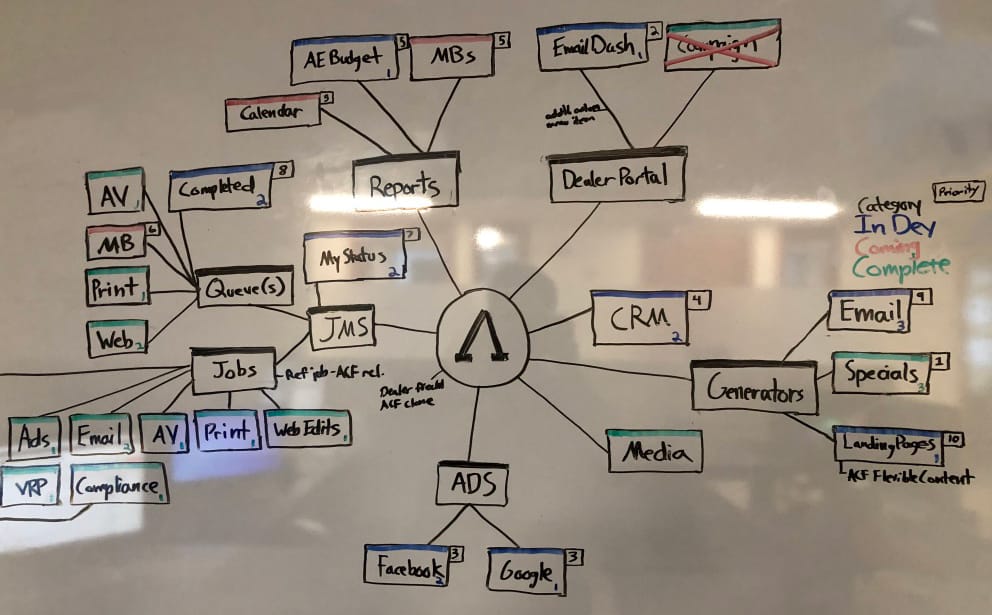
Optimizing Performance & Accessibility
Phalanx included job queueing, staff performance dashboards, and client relationship management tools to support the full lifecycle of digital production. I implemented testing and optimization workflows using Litmus for email QA, WAVE for accessibility auditing, and Google PageSpeed Insights to improve the performance of both the system and the responsive, accessible digital assets it produced.
Scaling the Solution
Phalanx went on to produce over 90% of AMSI’s digital assets. For highly customized projects, I provided manual builds that still adhered to the system’s design and compliance standards. The platform became central to AMSI’s operations, delivering consistent quality at scale and directly contributing to major gains in efficiency, output, and return on investment.
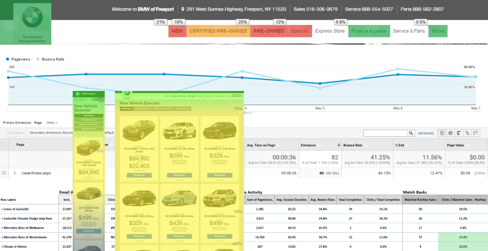
View an example of a Phalanx Generated Email Campaign