


Jan 10 2025
Itel: AI Windows Touch Screen Apps for Insurance Samples
I was the principal product designer for two AI-powered Windows touchscreen apps used by major insurers. I modernized legacy systems and created responsive, accessible interfaces that streamlined sample processing, reduced errors, and fit real hardware and code constraints.
Outcomes
- Delivered two AI-powered Windows touchscreen applications used by major insurance companies including Allstate and State Farm
- Significantly reduced user error and physical effort in lab workflows
- Improved system clarity, task speed, and onboarding through native-feeling, Windows-compliant interfaces
- Modernized outdated and inefficient legacy systems
- Enabled faster, more accurate sample identification and management at scale
- Reduced development time and rework by building within technical constraints and using component reuse
Problem
Itel needed to modernize and streamline its insurance sample processing systems, which included outdated legacy touchscreen software and entirely new workflows powered by AI. The legacy system had poorly labeled controls, unclear error messaging, inefficient layouts, and inconsistent navigation that led to slow adoption and frequent mistakes. The new AI-based hardware workflows required entirely new UX paradigms to reduce user error, integrate camera-based sample detection, and provide intuitive control within highly specific physical setups.
Both systems had to work with strict technical constraints, including inflexible legacy code and hardware limitations, while serving high-volume, regulated workflows involving insurance samples and lab processing. Success required eliminating error-prone processes, reducing training time, delivering fully responsive and accessible designs, and ensuring UI clarity in real-time, touchscreen environments.
Solution I Applied & Why
Project Titan: Designing the AI Camera Workflow
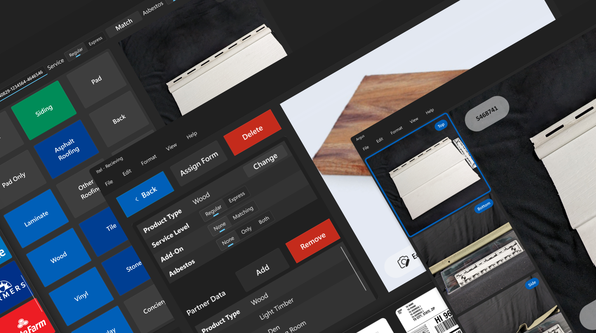
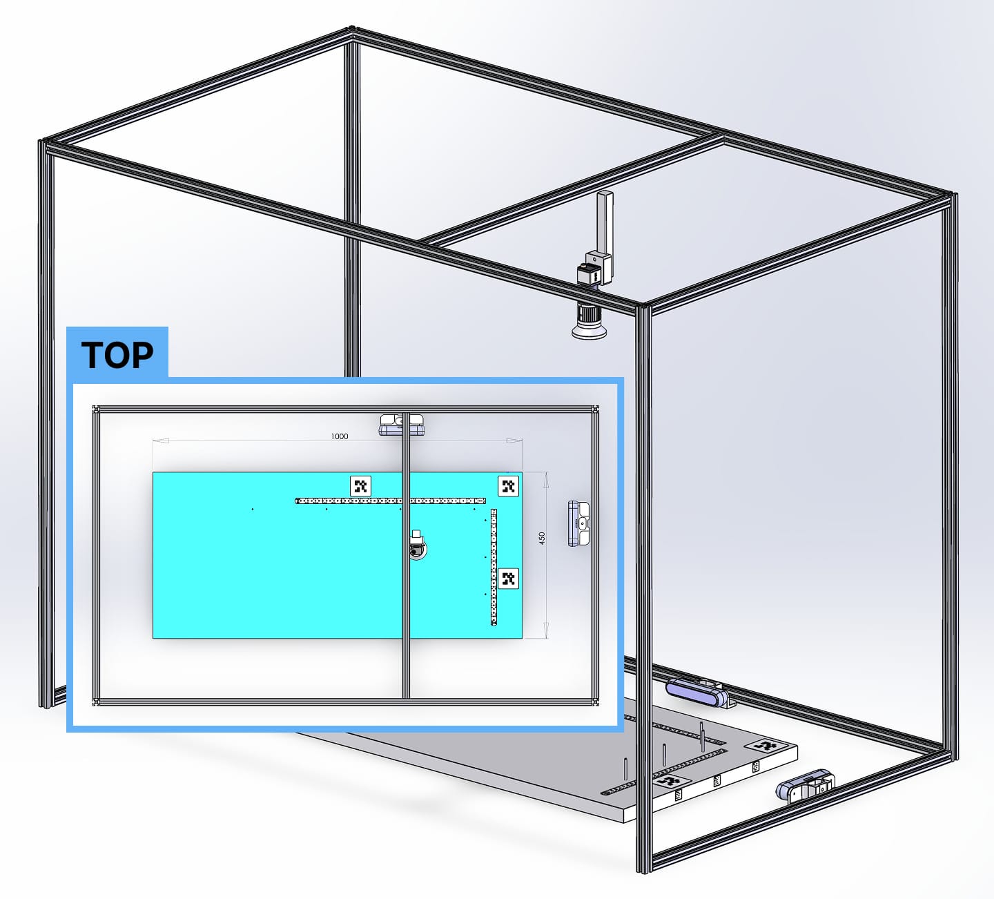
I was the principal product designer and researcher for two AI-powered Windows touchscreen applications. The first, Project Titan, was built to identify housing samples using three live camera feeds and prepare them for shipping or lab analysis.
I began by identifying the physical and digital workflows needed for accurate and efficient sample placement. This involved designing both movable and fixed workstation elements to reduce unnecessary motion and complexity. Camera positioning and lighting were configured for optimal AI performance. These hardware-integrated workflows required a deep understanding of the physical setup and how to create a digital interface that would minimize user error and maximize speed and control.
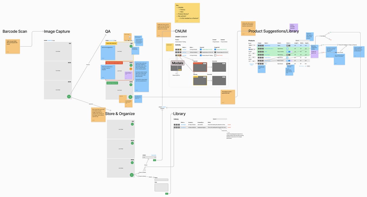
Working closely with the CTO, developers, product teams, and lab workers, I created low-fidelity prototypes in FigJam and ran walkthroughs of each workflow. These iterations revealed edge cases and usability issues early, preventing expensive rework and aligning features with real-world conditions.
Since the product was built for a Windows touchscreen environment, I used Microsoft’s official Windows Figma file to create a native-feeling design system. Custom components were only introduced when essential. This approach kept development efficient while ensuring the experience was consistent with other Windows applications.
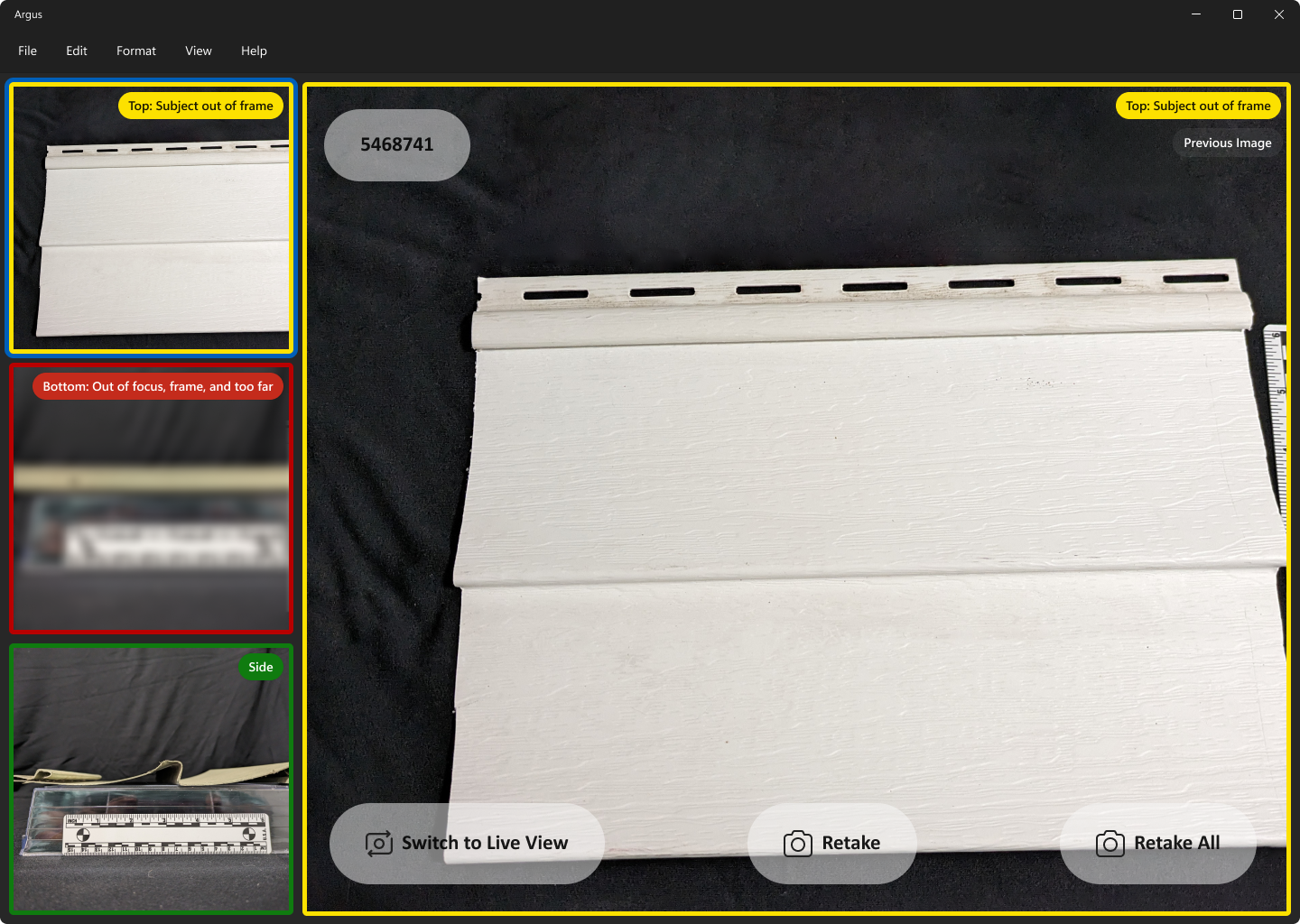
The main screen presented live feeds from three cameras on the left and a larger preview on the right. Users could capture all three images simultaneously using a single button. The next screen verified captured images, where the AI evaluated focus, positioning, and recognition.
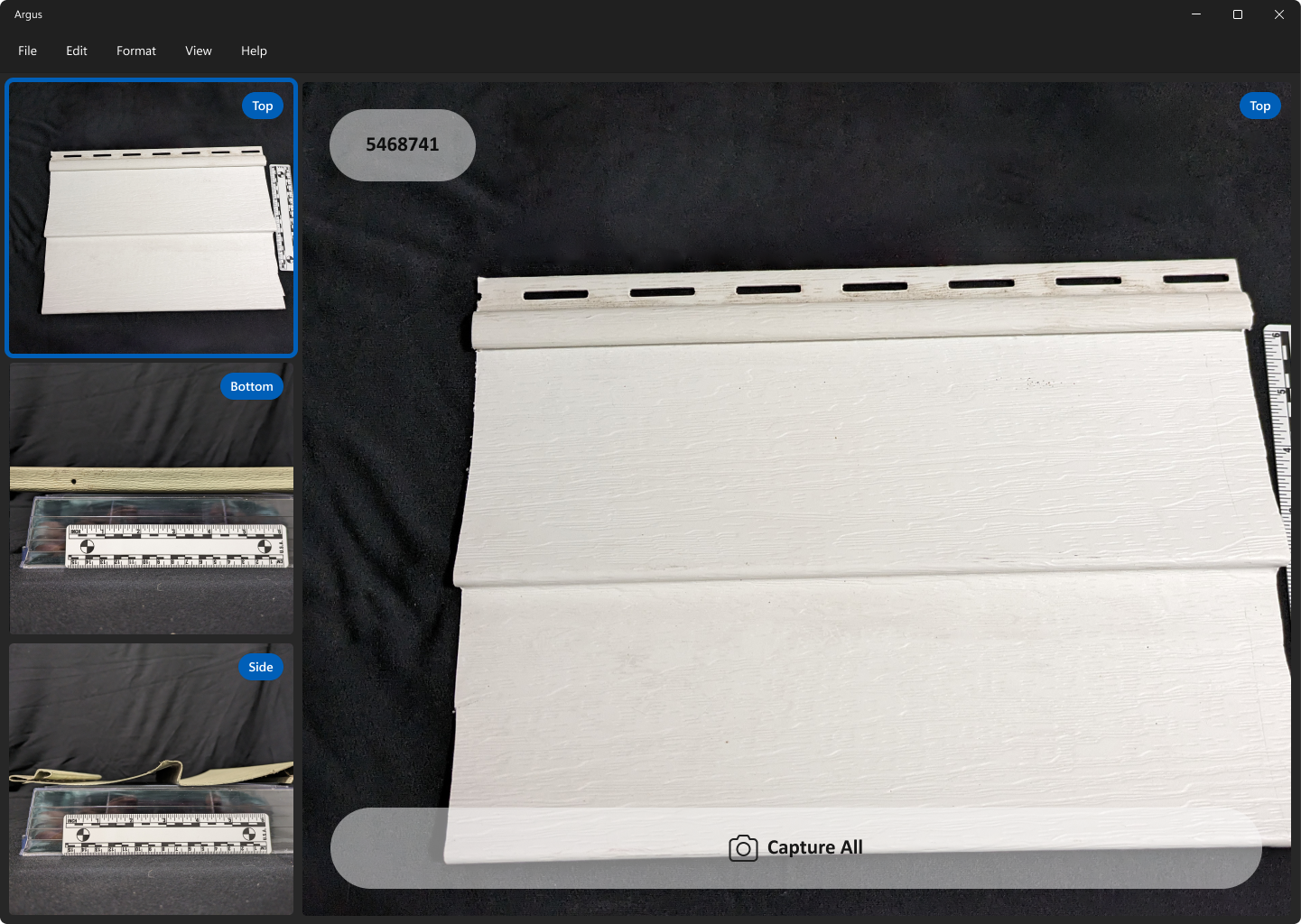
Results were color-coded as green (pass), yellow (soft fail), or red (hard fail). Users could toggle between captured and live views to retake photos until all passed. Every interface was built to be fully responsive and accessible across device types and user needs.
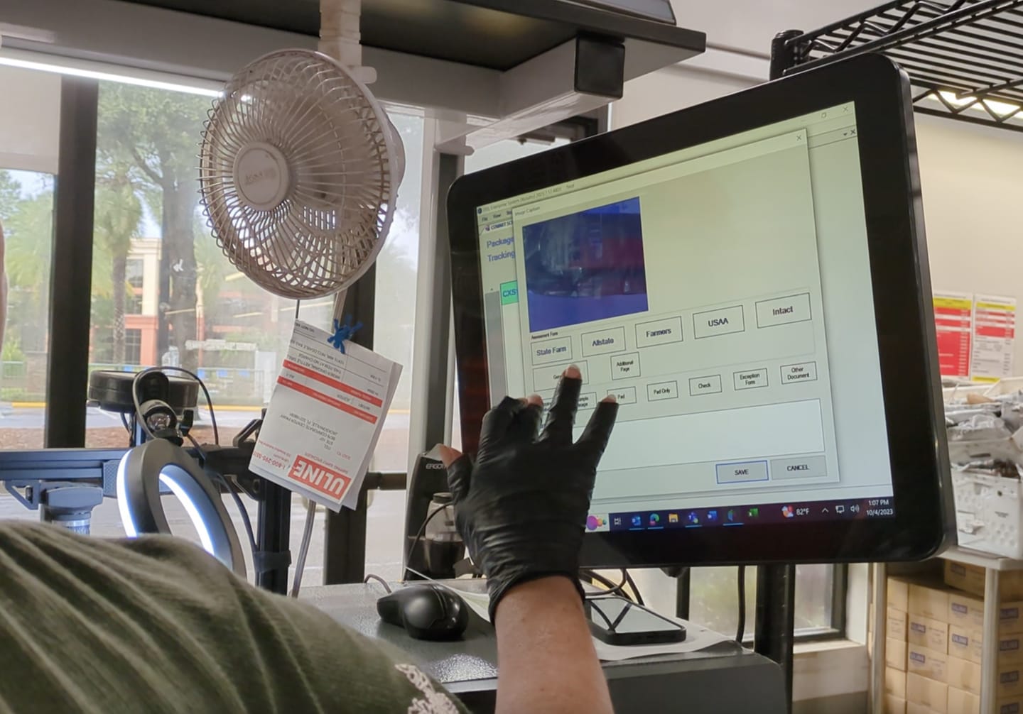
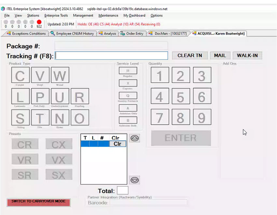
Project Receiving: Redesigning the Legacy System
The second application, Project Receiving, replaced a legacy Windows touchscreen interface that had suffered from years of technical debt and usability neglect. Users struggled with ambiguous controls, disorganized layouts, and unclear system feedback.
I collaborated directly with developers, architects, product managers, and executive stakeholders to identify what could realistically be improved within the constraints of the existing codebase. Once the new flow was agreed upon, I iterated on designs that balanced usability improvements with technical feasibility.
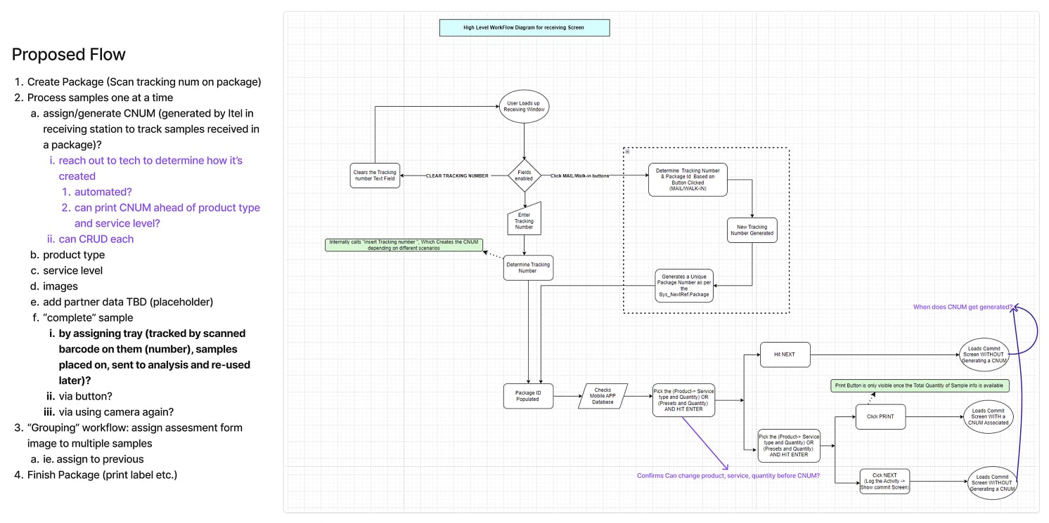
Low-fidelity flows were developed in FigJam and validated with stakeholders before moving to high-fidelity design. I extended custom components from Project Titan, allowing for design consistency while minimizing new development time. As with Titan, all designs were fully responsive and accessible, following modern best practices and Windows-native interaction patterns.
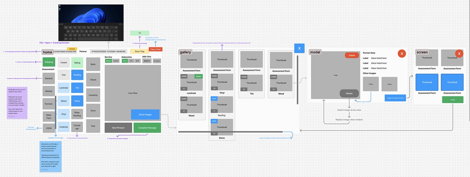
The first redesigned screen allowed users to identify insurance providers, input sample details, and tag and package items, all while viewing a live verification feed from a connected camera. Core design principles included placing the most frequently used actions near the user, applying color coding to communicate brand and task type, and visually grouping controls to reduce cognitive load. All scrollable areas featured visible scrollbars, and primary navigation controls were persistently placed at the top of the screen.
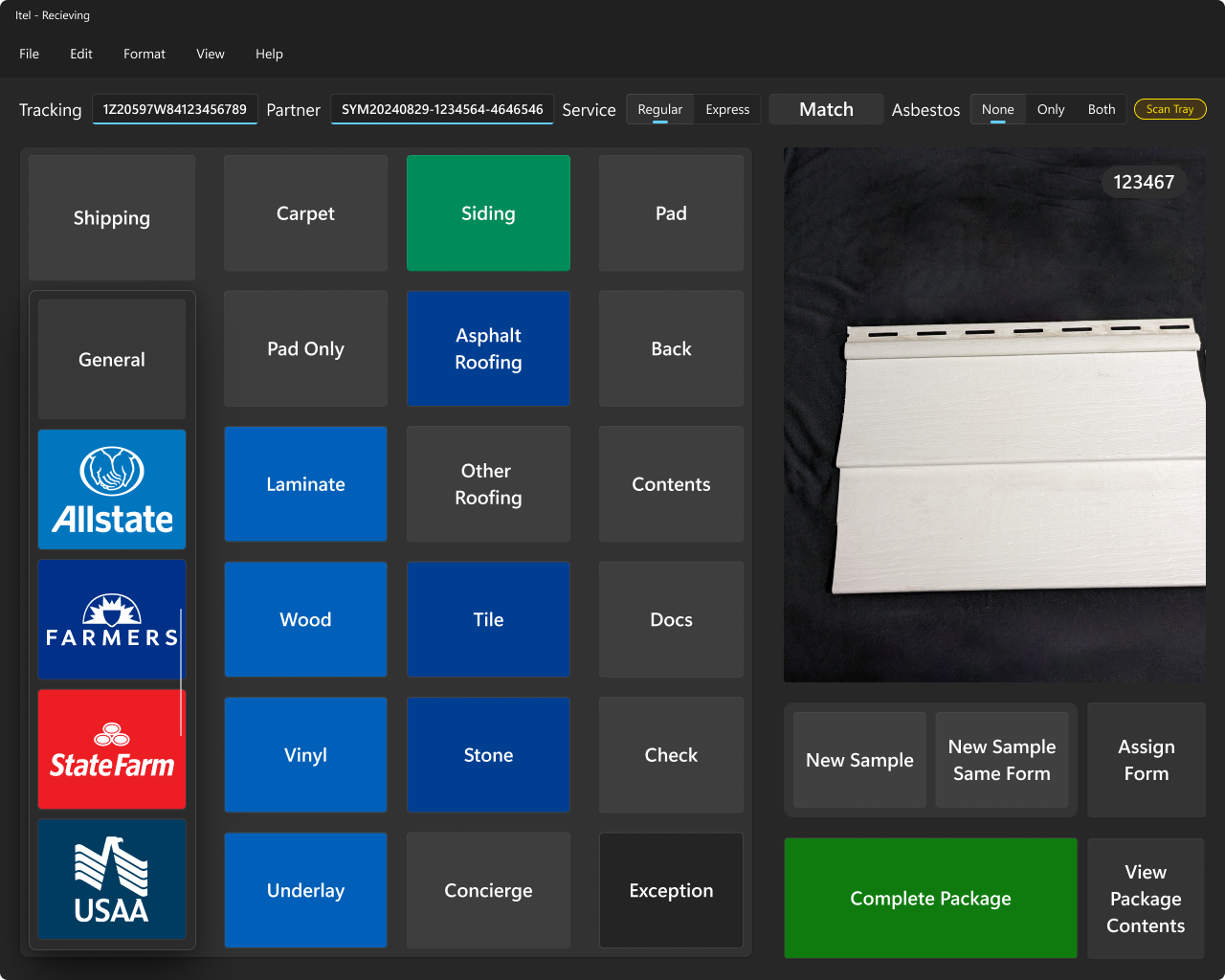
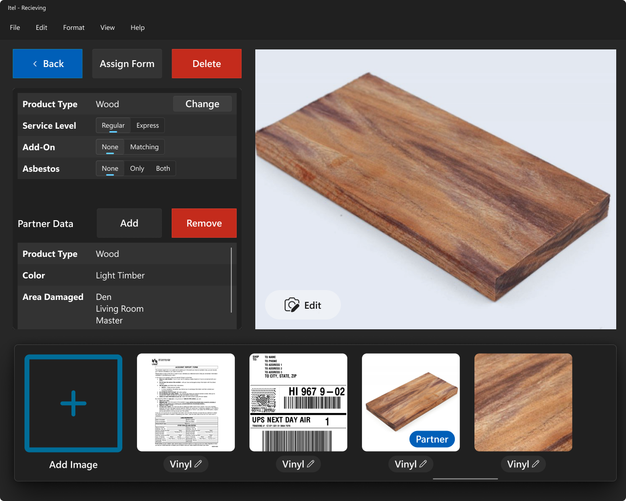
Subsequent screens showed added samples, their shipping and lab tray assignments, and allowed users to view or edit associated documentation and photos.
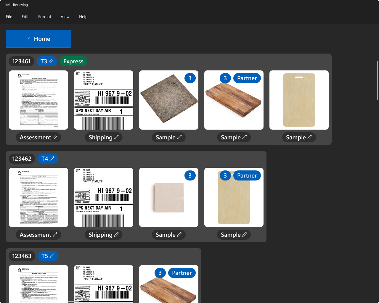
A final screen supported product management tasks such as editing, viewing, or deleting data tied to individual samples and their assets.
Design Approach Across Both Projects
Throughout both projects, I emphasized fast iteration, real-world testing, and close collaboration with stakeholders. I led UX research, wireframing, prototyping, and high-fidelity UI design using Adobe XD and Figma. All systems were built to be responsive, accessible, and optimized for users working within physical and technical constraints.
I applied a consistent set of design principles to maximize usability, reduce cognitive load, and ensure efficient workflows:
- Placed most-used actions on the left side of the screen to reduce time-to-target and minimize physical effort
- Used color coding to communicate insurance brand identity and functional priority
- Grouped related controls visually to enhance scannability and reduce confusion
- Ensured all scrollable areas had visible scrollbars to indicate additional content
- Fixed primary identifying information and key controls at the top of the screen for quick access
- Followed Windows-native language, navigation patterns, and interface conventions to lower the learning curve
- Scaled control size and visual weight according to usage frequency and importance to establish clear hierarchy
I built upon Microsoft’s official Windows design system to maintain consistency and reuse components across both applications. This reduced development time, improved maintainability, and delivered an experience that felt intuitive and seamless to end users.