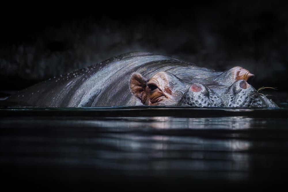
18+ Years of Experience
Creating and optimizing AI powered and AI free apps and websites through research, design, development, photography and testing, that create positive impacts to lives and bottom lines.
I begin by interviewing users and stakeholders, and scoping out the competition to gather insights and define goals. AI is leveraged to ideate for persona development. This information is organized, analyzed, and documented to guide the project.
User stories and flows are created to establish a blueprint, branding and design systems lay the foundation, then wire-frames and interactive high-fidelity prototypes define the structure.
I have worked as both a team member and a solo contributor to deliver complete experiences. I strive for clean, well documented, minimal, and modular code. I use version control and manage projects across local, staging, and production environments.
Once the product is live, I review real user and AI simulated user usage, revisit user feedback, and identify new opportunities to improve and evolve the product.
This method saves significant development time by making updates through flexible design rather than rigid code. It allows the product to grow in step with user needs and business goals.
Jan 10 2025
I was the principal product designer for two AI-powered Windows touchscreen apps used by major insurers. I modernized legacy systems and created responsive, accessible interfaces that streamlined sample processing, reduced errors, and fit real hardware and code constraints.
Itel needed to modernize and streamline its insurance sample processing systems, which included outdated legacy touchscreen software and entirely new workflows powered by AI. The legacy system had poorly labeled controls, unclear error messaging, inefficient layouts, and inconsistent navigation that led to slow adoption and frequent mistakes. The new AI-based hardware workflows required entirely new UX paradigms to reduce user error, integrate camera-based sample detection, and provide intuitive control within highly specific physical setups.
Both systems had to work with strict technical constraints, including inflexible legacy code and hardware limitations, while serving high-volume, regulated workflows involving insurance samples and lab processing. Success required eliminating error-prone processes, reducing training time, delivering fully responsive and accessible designs, and ensuring UI clarity in real-time, touchscreen environments.
I was the principal product designer and researcher for two AI-powered Windows touchscreen applications. The first, Project Titan, was built to identify housing samples using three live camera feeds and prepare them for shipping or lab analysis.
I began by identifying the physical and digital workflows needed for accurate and efficient sample placement. This involved designing both movable and fixed workstation elements to reduce unnecessary motion and complexity. Camera positioning and lighting were configured for optimal AI performance. These hardware-integrated workflows required a deep understanding of the physical setup and how to create a digital interface that would minimize user error and maximize speed and control.

Working closely with the CTO, developers, product teams, and lab workers, I created low-fidelity prototypes in FigJam and ran walkthroughs of each workflow. These iterations revealed edge cases and usability issues early, preventing expensive rework and aligning features with real-world conditions.
Since the product was built for a Windows touchscreen environment, I used Microsoft’s official Windows Figma file to create a native-feeling design system. Custom components were only introduced when essential. This approach kept development efficient while ensuring the experience was consistent with other Windows applications.

The main screen presented live feeds from three cameras on the left and a larger preview on the right. Users could capture all three images simultaneously using a single button. The next screen verified captured images, where the AI evaluated focus, positioning, and recognition.

Results were color-coded as green (pass), yellow (soft fail), or red (hard fail). Users could toggle between captured and live views to retake photos until all passed. Every interface was built to be fully responsive and accessible across device types and user needs.

The second application, Project Receiving, replaced a legacy Windows touchscreen interface that had suffered from years of technical debt and usability neglect. Users struggled with ambiguous controls, disorganized layouts, and unclear system feedback.


I collaborated directly with developers, architects, product managers, and executive stakeholders to identify what could realistically be improved within the constraints of the existing codebase. Once the new flow was agreed upon, I iterated on designs that balanced usability improvements with technical feasibility.

Low-fidelity flows were developed in FigJam and validated with stakeholders before moving to high-fidelity design. I extended custom components from Project Titan, allowing for design consistency while minimizing new development time. As with Titan, all designs were fully responsive and accessible, following modern best practices and Windows-native interaction patterns.

The first redesigned screen allowed users to identify insurance providers, input sample details, and tag and package items, all while viewing a live verification feed from a connected camera. Core design principles included placing the most frequently used actions near the user, applying color coding to communicate brand and task type, and visually grouping controls to reduce cognitive load. All scrollable areas featured visible scrollbars, and primary navigation controls were persistently placed at the top of the screen.

Subsequent screens showed added samples, their shipping and lab tray assignments, and allowed users to view or edit associated documentation and photos.

A final screen supported product management tasks such as editing, viewing, or deleting data tied to individual samples and their assets.

Throughout both projects, I emphasized fast iteration, real-world testing, and close collaboration with stakeholders. I led UX research, wireframing, prototyping, and high-fidelity UI design using Adobe XD and Figma. All systems were built to be responsive, accessible, and optimized for users working within physical and technical constraints.
I applied a consistent set of design principles to maximize usability, reduce cognitive load, and ensure efficient workflows:
I built upon Microsoft’s official Windows design system to maintain consistency and reuse components across both applications. This reduced development time, improved maintainability, and delivered an experience that felt intuitive and seamless to end users.
Jan 01 2024
I redesigned SpendHQ, an AI-powered spend intelligence platform used by Fortune 500 companies like Pepsi and Under Armour. My work increased NPS by 133%, boosted product stickiness by 125%, extended session times by 50%, and modernized over 200 screens with responsive, accessible design.
SpendHQ is a spend intelligence platform used by Fortune 500 companies to analyze supplier and third-party data related to cost, diversity, and clean energy initiatives. When I joined the team, the platform had a dated, fragmented, and inconsistent user experience that caused cognitive overload and slowed task completion.
There were no formal user feedback systems in place. Without user behavior tracking, research artifacts, or analytics tools, it was difficult to identify or prioritize pain points. The platform served a diverse user base that included financial analysts, procurement officers, and C-suite executives, each with different needs. Yet the UI failed to account for those differences.
Additionally, the product lacked a design system or consistent process, which led to inefficiencies in both collaboration and development. Each new feature introduced more inconsistencies and technical debt, making it harder to scale or maintain the platform.

To uncover user pain points and opportunities, I implemented tools such as Pendo and Hotjar. These provided real-time insight into user behavior and metrics such as retention, NPS scores, and heatmap activity. I supplemented this data with competitive audits, stakeholder interviews, and direct user testing.
Working with the head of product, I defined four core personas based on our research. These represented the platform’s primary user types, from technical analysts to executive-level decision-makers. I mapped out detailed user flows using FigJam to visualize key paths through the platform and identify bottlenecks, aligning those flows with strategic business objectives.

To support current and future versions of the product, I built a comprehensive Figma design system based on atomic design principles. This included centralized design files, reusable components, and a scalable structure that supported both legacy screens and new workflows. These assets made cross-functional collaboration faster and easier while maintaining UI consistency.
To further streamline delivery, I facilitated design workshops with stakeholders, developers, and product owners. These sessions ensured alignment, reduced handoff friction, and helped uncover technical or business constraints early in the process.

One of the most impactful changes was the redesign of the global “Power Filter,” a widely used tool for refining data across the platform. The original version was overcomplicated and lived on a separate screen, disrupting workflows. I transformed it into an accessible, modular, sticky header component that streamlined interaction. User testing and high-fidelity prototyping showed a significant increase in task speed and user satisfaction.

I also executed a full visual reskin and UX overhaul across over 100 screens. This reduced cognitive load, enforced consistent component usage, and made the interface easier to navigate. To support new users and reduce reliance on support teams, I created an integrated help system with contextual pop-overs and dedicated documentation sections.
To avoid wasted engineering effort, I developed interactive prototypes and gathered early feedback before handoff. This iterative approach saved hundreds of development hours and ensured features met real user needs.
Leading SpendHQ’s transformation involved establishing scalable design processes, leveraging data-driven insights, and fostering cross-functional collaboration. By prioritizing user needs and aligning them with business goals, I delivered a modern, intuitive platform that significantly improved engagement, satisfaction, and scalability. The project not only enhanced the experience for SpendHQ’s users but also set a strong foundation for ongoing development and innovation.
Nov 01 2020
I developed and improved websites for NASCAR, launching platforms like NASCAR Mexico and ARCA Menards, enhancing NASCAR.com and IMSA.com, and supporting high-traffic race events. My work achieved a 40% ROI through WordPress development and UX/UI design.
As NASCAR transitioned away from third-party vendors and moved development in-house, the organization faced several skill misalignments. Developers repurposed from other projects were tasked with complex WordPress builds despite limited experience in PHP or WordPress. At the same time, graphic designers without a UX/UI background were expected to produce functional digital experiences.
This mismatch led to collaboration challenges, execution delays, and inconsistent quality. NASCAR also required digital platforms capable of supporting live race updates, real-time interactions, and high traffic during major events. These demands made it essential to tightly integrate design and development while working within the constraints of NASCAR’s custom WordPress framework.

To address the initial disconnect between design and development, I joined creative briefings with product managers and graphic designers to review project goals, research insights, and constraints. I provided feedback early in the design process to ensure that layouts followed UX best practices, adhered to accessibility standards, and were feasible within the limitations of NASCAR’s custom WordPress environment.
This proactive alignment helped eliminate rework and improved the overall quality and consistency of the final product.

I was the lead developer of three new websites: NASCAR Mexico, ARCA Menards, and Sebring Raceway. Each required tailored modifications to NASCAR’s WordPress themes and plugins. I ensured that all builds were responsive, accessible, and scalable, meeting both user needs and long-term maintainability requirements.
To manage development efficiently, I used Atlassian Jira for task tracking, QA feedback, and documenting technical updates.
Beyond new builds, I also delivered performance enhancements and user experience improvements to existing platforms, including NASCAR.com and IMSA.com. These updates addressed technical issues and usability gaps, improving consistency and functionality across key fan-facing channels.

Working on-site at NASCAR headquarters in Charlotte, NC, I played a key role in live event operations. During race weekends, I monitored digital systems and resolved real-time technical issues, such as lap-time reporting errors, to ensure uninterrupted service. This work required close coordination with the live ops team and a deep understanding of NASCAR’s tech stack and infrastructure.
One of my most impactful contributions was serving as the bridge between the design and development functions. I translated visual design into scalable, maintainable code and provided UX guidance to ensure the final product matched both business goals and user expectations.
By maintaining responsive, accessible standards and solving technical and workflow challenges under pressure, I helped NASCAR achieve digital consistency and high performance across platforms.
My work combined strong technical execution with cross-functional collaboration to deliver digital experiences that met NASCAR’s high standards and supported their shift to in-house delivery. The successful launch of three major websites, enhancements to key platforms, and reliable live event support demonstrated my ability to perform in high-pressure environments while creating scalable systems for future growth.
Feb 01 2020
I designed and developed Wick, a well-being mobile app with a gamified, science-based approach. With a 100% user approval rating and no direct competition, Wick transformed complex health concepts into an engaging, supportive user journey.
Improving well-being through science-backed methods is often overwhelming. Users are expected to learn complex psychological concepts while managing multiple personal goals, which can become discouraging and unsustainable. The wellness app space lacked tools that made learning actionable and enjoyable while maintaining empathy and user engagement.
Most existing solutions failed to combine evidence-based practices with engaging, accessible design. The challenge was to create a product that helped users understand and apply well-being science while staying motivated and feeling supported through the process.
To uncover gaps in the market and guide development, we performed a SWOT analysis on 25 leading wellness and self-improvement apps. This analysis revealed clear opportunities to improve user engagement through better gamification and emotional connection. Many apps offered repetitive, clinical interfaces that failed to inspire continued use.
View the user testing script
We then conducted user interviews, collecting both quantitative and qualitative insights from adults aged 19 to 40. These included data on app usage habits, frustrations, and levels of interest in a nature-inspired, supportive solution. The findings informed the development of user personas that reflected a range of well-being goals and life contexts.
Card sorting and ideation sessions followed, helping prioritize features and structure user flows.

Moodboarding and branding exercises were used to establish Wick’s tone and visual language, emphasizing warmth, nature, and comfort. The name and motif of a fire served as a metaphor for the user’s inner well-being journey, shaping both the branding and interface design.

We began the design process by translating whiteboard sketches into wireframes and developing a low-fidelity prototype focused on testing core features.


User feedback gathered from initial testing highlighted several pain points and feature gaps, which were then addressed in a fully developed high-fidelity prototype.

The high-fidelity design integrated all tested user states, with a consistent visual language rooted in the nature-based moodboard and branding decisions. The result was an experience that felt supportive, warm, and clear at every step.

To transform well-being science into manageable, motivating actions, we designed a gamified system that awarded users with points, badges, and progress indicators. Rewards were tiered based on task complexity, encouraging progression and celebrating small wins. This approach resonated strongly with users in testing, creating a sense of progress without pressure.
The app’s empathetic tone and visual consistency played a central role in engagement. By pairing adventure-inspired UI patterns with psychologically grounded content, Wick maintained motivation without relying on gimmicks. Its interactive format and warm, supportive voice set it apart in a crowded market.
View the style guide documentation
Wick successfully transformed complex well-being science into a digestible, gamified mobile experience. The product stood out in a crowded wellness space by blending evidence-based content with empathetic, user-centered design.
With a 100% user approval rating, the final product proved to be both engaging and emotionally resonant, setting a strong example of how thoughtful UX and meaningful communication can turn abstract goals into real, motivating outcomes.
View the complete Adobe XD prototype
Sep 01 2019
I designed and led development of Phalanx, a custom system that streamlined AMSI’s digital production, increased task efficiency by 400%, reduced errors by 90%, and delivered a 50% ROI while ensuring compliance across ads, emails, and websites.
AMSI, an agency handling digital advertising for automotive clients, was operating without a centralized project management or production system. The workflow was fragmented and manual, leading to frequent issues in responsiveness, accessibility, coding, and OEM compliance. These problems not only slowed production but also put clients at risk of non-compliance penalties.
Without a system to streamline asset creation or monitor performance, internal teams were siloed and overwhelmed. Projects often required duplicative work, QA suffered, and there was no scalable way to ensure consistency across responsive, accessible websites, emails, and ads. AMSI needed a full-stack solution to fix these bottlenecks and unify its design and development workflows.

When I started working at AMSI, I was designing and developing display ads, emails, and websites. It quickly became clear that recurring inefficiencies, poor collaboration, and inconsistent quality were major issues. These problems were visible in everything from code quality to missed accessibility and compliance standards.
After identifying the operational gaps, I designed and developed a prototype for what would become Phalanx, a centralized production and project management system. I presented the concept, gained approval, and took full ownership of its development and evolution. I also led a team of designers and developers to support ongoing maintenance and feature expansion.

I built Phalanx using HTML, CSS, Sass, JavaScript, and PHP, integrating it with a custom WordPress environment. The platform featured tailor-made drag-and-drop modules, a reusable UI component library, and built-in compliance checks. Every element I designed and developed was fully responsive and met accessibility standards. I also built in systems for budget tracking, project management, staff assignments, and performance monitoring to address broader operational needs.
To ensure the platform aligned with real-world workflows, I created detailed personas for every user type, including media buyers, ad specialists, email marketers, project managers, designers, developers, and A/V staff. I ran targeted user tests to validate features and interaction flows. I used Adobe XD to design and test wireframes and high-fidelity prototypes before development, which saved significant time and eliminated costly rework.

Phalanx included job queueing, staff performance dashboards, and client relationship management tools to support the full lifecycle of digital production. I implemented testing and optimization workflows using Litmus for email QA, WAVE for accessibility auditing, and Google PageSpeed Insights to improve the performance of both the system and the responsive, accessible digital assets it produced.

Phalanx went on to produce over 90% of AMSI’s digital assets. For highly customized projects, I provided manual builds that still adhered to the system’s design and compliance standards. The platform became central to AMSI’s operations, delivering consistent quality at scale and directly contributing to major gains in efficiency, output, and return on investment.

View an example of a Phalanx Generated Email Campaign
Founder
Product on Point
Previously
Product Owner at SpendHQ
UX Team Lead
The General
Previously
UX Lead at AMSI
Marketing Manager
Barron Lighting Group
Previously
VP at AMSI
Marketing Director
RJF Environmental Consulting
Previously
VP at Living Fresh Collection
Email, or call me 9a-5p EST, Monday through Friday.